We’ve talked in the past about using the focal point as the basis for a background color. These can reflect the colors in the focal point or the colors of the natural environment of the object. When it comes to a geometric pattern in your needlepoint, you may not have those.
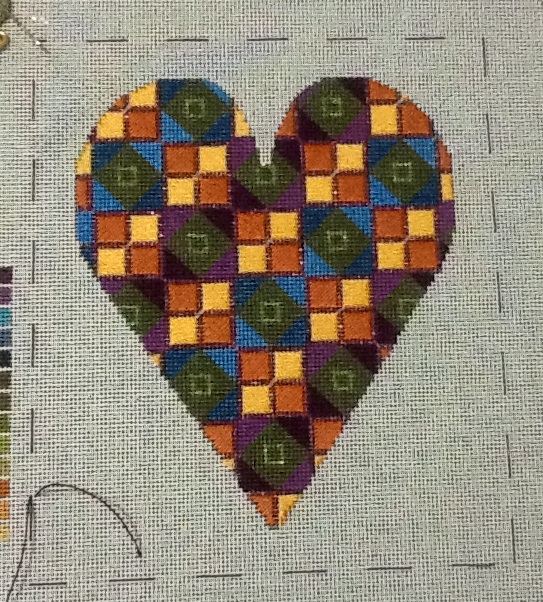
When that happens what do you do for a background. A stitcher faced this problem with this hear canvas.
Pick your Color
If your pattern’s color scheme monochromatic, pick a pale shade of that color.
If your pattern’s color scheme is complementary or analogous, pick a pale shade of one of those colors.
If your pattern is, as this is, multi-colored, then your choice is harder.
Neutrals (white, neutral grey, and some beiges and creams) work with most colors. Black only looks good if the colors are either bright or light and saturated (not soft).
The strategy for a background when it is a geometric pattern is to pick a color that will harmonize with the main stitching. Because there are lots of colors in this piece, you could choose any except olive since it’s the dominant color.
There are many companies that make these extremely pale shades that are almost white. They are my favorite threads for backgrounds,
I like using extremely pale shades of colors in the design for backgrounds as my default because they nicely echo what’s in the design but they stay firmly in the background. Many companies make these kinds of colors.
Besides yellow, rust or blue could be used. My only problem with them is that I think the pale yellows are better colors. Many of the blues look too wimpy and the rusts tend to be a bit too peachy. But this is just my opinion.
What about Stitches?
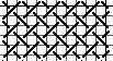
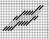
Picking a stitch for these backgrounds can also be a challenge. While there are many stitches that almost always work as backgrounds, for example Woven Plait, below top, or Diagonal Victorian Step, below bottom, you also have an opportunity with a geometric canvas to pick a stitch that echoes the shapes in the canvas.
Let’s look at the design again thinking about the stitches. You can see that there are lots of squares in several sizes, arranged in diagonal rows.
We have two things that could be elements for the background: squares and diagonals. Because the diagonals run in both directions (it’s a checked pattern), concentrating on the squares would make a better background choice because it would not fight with design elements. Diagonal backgrounds would almost always favor one diagonal over the other and skew the balance.
Because the heart’s pattern is squares it has a pretty obvious grid structure. Picking a square stitch with an obvious grid would put too much emphasis there. So would framing.
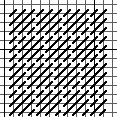
Now I know I need a square stitch without an obvious grid structure and no framing. A stitch that meets all these requirements is Offset Scotch, below, which would be my choice.
Finding a background stitch is more challenging than finding a background color. Conquer it by looking at your canvas and seeing the shapes and lines present in your design. Once you find them, think of stitches that have these elements. Mentally picture them as backgrounds. Do they fight with other elements of the design? Do they put too much emphasis on something? Can they be varied to work?
As you go through the process you’ll find prospects. If you can’t decide between them, stitch a bit of one at a time near the focal point. I can almost always feel that something doesn’t work fairly early in the process.

About Janet M Perry
Janet Perry is the Internet's leading authority on needlepoint. She designs, teaches and writes, getting raves from her fans for her innovative techniques, extensive knowledge and generous teaching style. A leading writer of stitch guides, she blogs here and lives on an island in the northeast corner of the SF Bay with her family
Leave a Reply