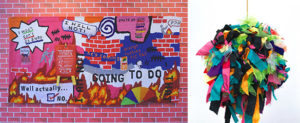
Recently pantone announced a new color palette, Vibrant Rebellion. Let’s set aside for a moment Pantone’s hyperbole and look at the colors.
There are seven colors. Black and a light cool grey are joined by five more colorful shades. I like them, they are brigt and cheery. I could easily see them being used in masny settings.
But while I think they are great, I don’t see them as being either overly vibrant and not at all rebelious. The colors are not at full saturation, in fact they are dulled a bit with white. To me that lifts them out of edgy rebeliousness and into the realm of vintage children’s books, lady-like clothes, and nostalgia.

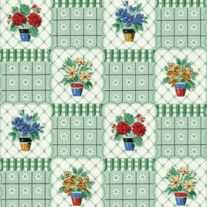
Maybe it’s using so many together that makes them edgy. But even there I don’t think so. Consider this charming wallpaper from Bradbury & Bradbury”s 1940’s Vintage Collection. It’s reproduced from papers of that time. Do the colors look familiar? Thay are from this rebellious palette.
About Janet M Perry
Janet Perry is the Internet's leading authority on needlepoint. She designs, teaches and writes, getting raves from her fans for her innovative techniques, extensive knowledge and generous teaching style. A leading writer of stitch guides, she blogs here and lives on an island in the northeast corner of the SF Bay with her family

Leave a Reply