
Updated June 11, 2019.
This Daffodil Bargello boxtop is one of my all-time favorite Bargellos. One of the things I love about Bargello is that it gives me time to think. On this piece, I thought about how the “random” look of the scrap Bag project is actually planned using some guidelines so that it looks random, but still is a good composition.
So I thought I’d share them with you today. The guidelines themselves are in bold, so you can easily skim the article for them.
1. If your piece is reflecting something in real life, follow the real life thing for color ideas. I made daffodils. I chose yellow, some orange, and some white. Yellow by far predominates. And orange and white are only used in certain places. Orange is always a trumpet on a daffodil, never the petals. So orange only is in the center of motifs. White is almost always petals, not trumpets, so, except for one motif, it is only on edges. In yellow daffodils, the trumpet tends to be a brighter or more intense color than the petals, although this difference can be very subtle. On each motif, the inside is a darker, brighter, or more intense color than the outside.
Your item may have fewer or different guidelines, but use it to pick the colors in your Bargello.
2. Pick a color or shade not used elsewhere for your outline. This kind of Bargello looks best if there is an outline running completely through the piece. Here it’s the green of leaves. It could be the lead color of stained glass, a lighter shade of the main color in a hearts piece. But do not use it anywhere else; using it will create visual “holes.”
3. Unless your motif is very small, do not repeat thread selections. You have defined your color palette and pulled all the threads you have in those colors. You have made your outline. The motifs have two or more colors in them. Never use the same two threads twice in the same combination.
4. Keep motifs using the same thread or threads somewhat distant from each other. I stitch one thread at a time and stitch 2-3 motifs using that thread scattered around the entire piece. I can always go back and add more with this thread if I want to. This makes the piece look random. It also keeps your eye from seeing matches and creating patterns.
5. Remember the 5-3-1 Rule. There should be one dominant color, yellow, one secondary color, green, and two accent colors, orange, and white. The outline color is generally the second color because it is throughout the piece. The two accent colors are about equal in this piece.
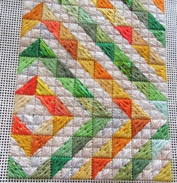
With these five rules in mind, you will be able to create some really wonderful Bargello using threads in your stash. Using these rules and a different technique I also made this charming needlepoint quilt project. It has lots more white (it’s the background) but I picked the colors in a similar fashion.

About Janet M Perry
Janet Perry is the Internet's leading authority on needlepoint. She designs, teaches and writes, getting raves from her fans for her innovative techniques, extensive knowledge and generous teaching style. A leading writer of stitch guides, she blogs here and lives on an island in the northeast corner of the SF Bay with her family
This looks aweseome! I love the colors!!