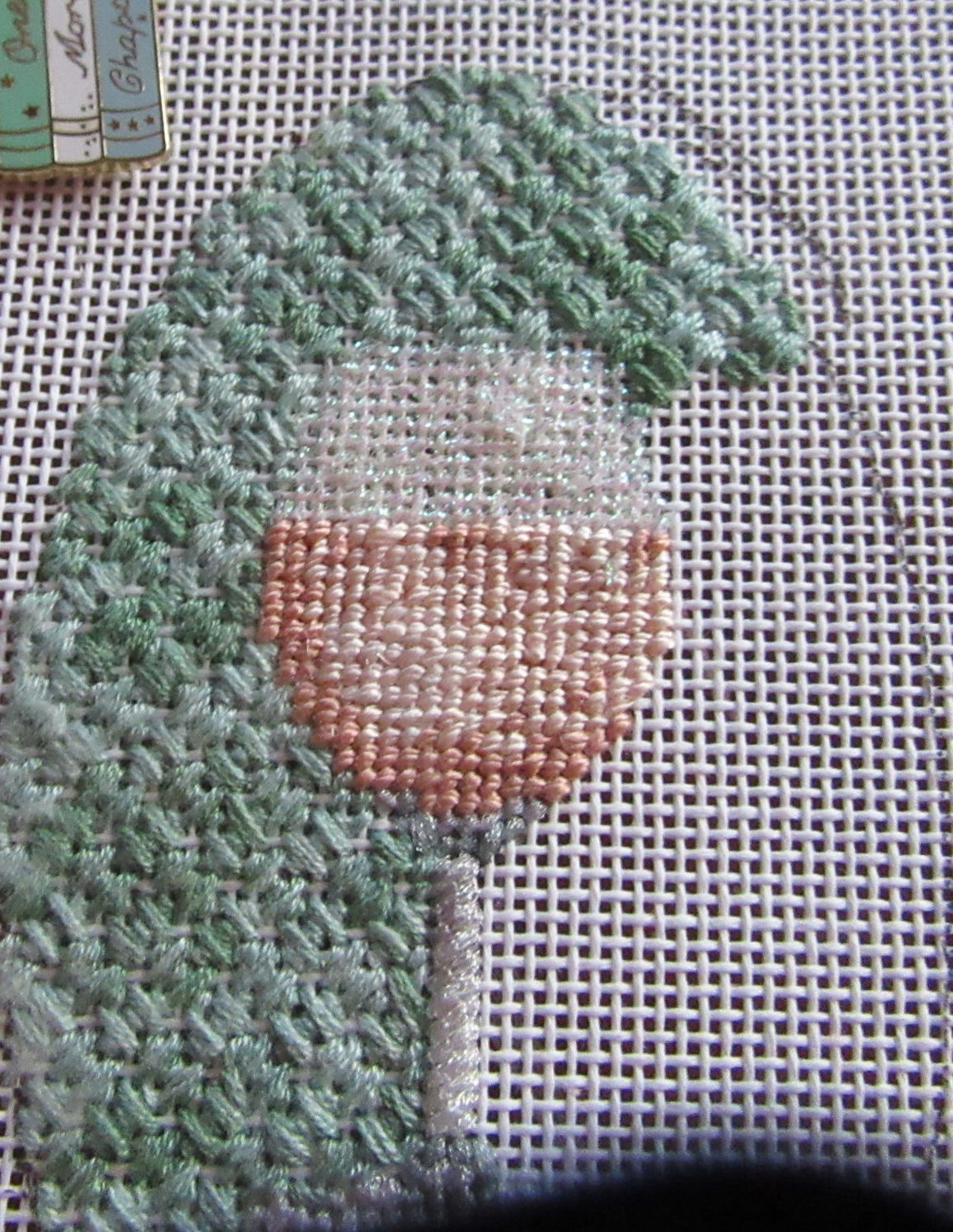
In my last article about stitching my rose wine, I talked about stitching the glass. Today I’ll cover the wine. If you remember from the glass post, the unstitched wine had three colors of peachy-pink. The picture below clearly shows that.

Normally that would mean shading, either needleblending or pixel shading. Because I used Grandeur, it would need to be pixel shading. I’d gradually lessen stitches in one color and increase the stitches in the adjacent color.
Look again! The space is tight, and in many places, the light and dark shades are almost adjacent. Pixel shading won’t work here; there is not enough room. Stitching as it’s painted won’t work either; it will create definite outlines and lines. This will not make the wine look as if it had natural highlights and shadows.
Shading works by allowing our eyes to create the intermediate shades. If I could make the outlines and lines less clear, perhaps that would do the trick. That’s exactly what I did. I feathered each light and dark area by adding some stitches at the edges. I stitched the dark, then the light, and was careful always to feather, even with a single stitch. Then I filled everything in with the middle shade. I think you’ll agree from the picture below; it’s pretty effective.


About Janet M Perry
Janet Perry is the Internet's leading authority on needlepoint. She designs, teaches and writes, getting raves from her fans for her innovative techniques, extensive knowledge and generous teaching style. A leading writer of stitch guides, she blogs here and lives on an island in the northeast corner of the SF Bay with her family
Leave a Reply