Updated May 28, 2021.
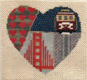
You may have remembered this canvas in its original form, I blogged about it several years ago. Thinking about it I decided that to do what I wanted to do, I was going to have to paint the canvas to get good coverage for the threads.
You can see the results above. Not very professional, is it?
No, and that’s why I’m blogging about it.
It’s important as stitchers to understand the difference between painting canvas for sale in a shop and painting canvas for ourselves.
The commercial canvas needs to be perfect, beautiful enough that when we walk into the shop we want to buy it. The paint should be even and shouldn’t clog any holes. If it’s stitch painted, the colors should change on intersections, not in between them.
There shouldn’t be stray bits of color on other parts of the canvas. All this and more go into making a canvas which will sell in the shops.
My purpose, and yours if you do this, is to make a canvas that I can stitch. I need to know enough where the colors should change and there should be enough of the correct color on the canvas so that if something peeks through it will blend with the thread color. There should be enough paint so that I won’t have to worry about putting a light color over a dark one.
I just need enough to make my stitching look good and to help with the coverage problem. I don’t need an even coat of paint, and the color doesn’t have to be perfect, just close enough.
The background behind the cable car is a case in point of the problem of color showing through. It’s going to be a night sky, so it will be dark blue. Chartreuse showing through dark blue will look very bad. But by coloring it blue with a Copic pen, the bluish-green will blend.
The street under the cable car is going to be a medium gray, the canvas was dark green. The thread I chose might not cover. So I painted it multiple coats of gray to get it to be a good street color. The dark green toned down the light gray, so it’s a good color now.
I’m thinking about Shadow Stitching for the bridge so I did that and even lighter gray. It may not work and I will have to stitch it solidly.
And the hearts might have an open stitch, so they got changed to red instead of copper.
The painting, as not ready-for-primetime as it was, ended up being good enough that the finished project turned out beautifully, below.

About Janet M Perry
Janet Perry is the Internet's leading authority on needlepoint. She designs, teaches and writes, getting raves from her fans for her innovative techniques, extensive knowledge and generous teaching style. A leading writer of stitch guides, she blogs here and lives on an island in the northeast corner of the SF Bay with her family

I’ve always looked at a painted canvas as a version of a “stitch guide.” It’s there to help us reach a finished piece but it’s also just a guide. It can be changed and altered to fit my vision of the finished look. Actually, the painting process is one dimensional and limited. So, let you creativity, needlepoint experience, and instinct win in the battle over “staying in the lines.”