Sean Adams, 2012, Abrams, ISBN: 078-4197-2391-9
Written primarily for graphic designers, this is an inspirational book about color. After a short introduction defining terms, the chapters cover colors in four categories: warm, cool, neutral, and specialty (fluorescent and metallic).
The first page of these chapters shows you the colors that will be covered with names and swatches. Each color has a number of pictures showing items that use that color. The text for each color tells you something about the color, the feelings it evokes, and some hints on using it. On these same pages are “other names” which are less synonyms than closely related colors. For example I woiuld think of charcoal as a dark grey and smoke as a light grey. Neither of them would I consider the same color as grey.
The pictures of different items from photos to reproductions of 19th Century art are instructive and inspiring as well as representative of the color.
For us as needleworkers the real value of the book comes from the five related palettes at the end of each color’s section. An example is pictured below.
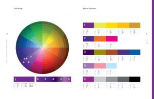
The color wheel shows where each of the examples of this color is located. Below it on the left is the base color with RGB, CYMK, and Pantone values below it. The right shows the five keystone shades so you can see how they relate. On the right-hand page are five color palettes, one for each of the keystone shades. They have between four and six shades and are wonderfully inspiring.
I could easily see these as the starting point for Bargello or geometric needlepoint pieces. They would also be useful when designing your own work or when you hope to change colors in a painted canvas. I liked that the combinations covered a wide variety of combinations, often ones that you wouldn’t find other places. The make the book well worth dreaming over.
The book, useful as it is is not without flaws. First RGB values (which you use for monitor display) are missing for everything except the initial basic shade of each color. While CYMK values are needed for printing, the other numbering systems would make the book more broadly useful.
I would also like to see names attached to the colors, even if they were just things like blue #20 along with an index that showed me in what palettes each was used. Then I could look at several possibilities for this color to find the one that suits.
If you are looking for a basic book about color teaching you about the main schemes and characteristics of color, this is not the book for you. But if you want a book on color to jump start ideas and give you lovely examples to look at, buy this.

About Janet M Perry
Janet Perry is the Internet's leading authority on needlepoint. She designs, teaches and writes, getting raves from her fans for her innovative techniques, extensive knowledge and generous teaching style. A leading writer of stitch guides, she blogs here and lives on an island in the northeast corner of the SF Bay with her family
Leave a Reply