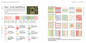
Last week I reviewed the wonderful book, Practical Color Combinations (find the review here). In it I talked about how you can use the combinations in the book to find your own scheme. In this article I’ll show you step-by-step how to do this, using the color combination pictured above.
Pick your Scheme and Colors
The color combination pictured above, Floret, is a soft pastel scheme. In it there are five pinks, two greens, and one each of yellow and blue. Looking at the sample shemes on the right, I’m drawn to the blue and pink 3-color combination that is the second thumbnail in the second row. Looking down the column I see small dots from these four schemes. The three colors used are the lightest pink, the dark coral pink, and the blue.
Looking on the left page for the colors I see they are Tender Beige (RGB:254/243/235), Rambling Rose (RGB: 239/133/139), and Mellow Sky (RGB: 191/219/225).
If you are not familiar with these numbers the first number is the amount of red, the second number the amount of green, and the third number the amount of blue. The numbers can go up to 256 and the higher the number, the lighter the color. This pure black is 000/000/000 and pure white is 256/256/256.
I’ll keep the book open as I continue to be a double check on the tread colors.
Translate to DMC
The next step is to translate the RGB values to DMC colors. Hapily there is an online tool for this. This tool converts RGB values to the closest DMC matches. Not only does it give you the closest match it also suggests three other possible flosses.
Lets’s see what comes up!
For the light pink, the RGB value is 254/243/235. When I run it through the converter, the closest match is 819, with an RGB value of 255/238/235. That makes it slightly less pink, more green, and the same in blue. The other three floss choices are 3866, 3865, and 712. The four flosses are pictured below (all the floss pictures are copyright Diane’s Creative Elements).
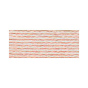
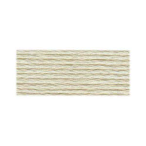
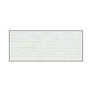
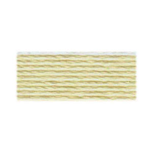
Looking at the choices, clearly 819 is the closest to my picture. The other colors, while not incompatible, would take my color scheme in a different direction.
For the dark pink, the RGB value is 239/133/139. The closest match is 3712 with RGB values of 241/135/135. It’s slightly less reed and green, and slightly more blue. The other floss suggestions are 962, 3833, and 899. Let’s see what they look like
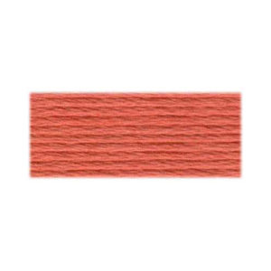
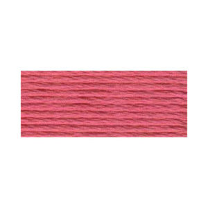
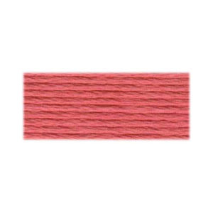
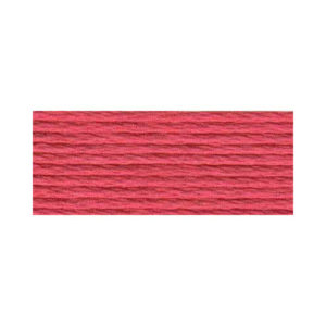
Looking at the choices, the best choice is less obvious here. The second and fourrth colors are too pink and don’t have that coral tone I like. Either the first or third would work. However the first choice is brighter than the third. Because I’m looking for a softer scheme, I’m leaning toward 3833. But I will wait to make a final choice.
For blue, the RGB value is 191/219/225. The suggested color is 3811 with an RGB value of 188/227/230. It’s less red and more blue and green. The other floss choices are 827, 3325, and 3752
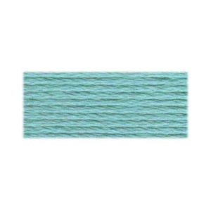
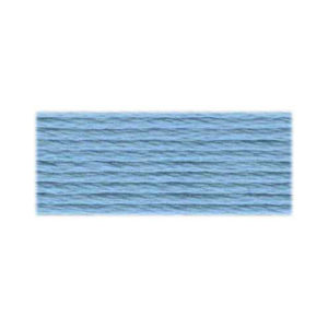
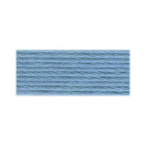
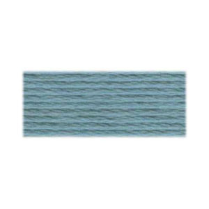
Looking at the choices, here’s another toughie. If I compare the floss colors to the scheme in the book, the first color is far too green. The fourth color is also too green and it is muted as well. That leaves the two more blue colors. I prefer the lighter shade 827. Because I am picking something more blue, I will go with the less orange pink so there isn’t such as strong contrast.
I have my color scheme: 819 (light pink), 3833 (coral pink), and 827 (blue).
The next step is to translate this to other threads.
Translate to Other Threads
If you know the DMC colors you want you can pull skeins of these colors when you shop and match them up to different threads. You can also do this with shipowners, a process I call talking DMC.
If you are on your own, you’ll have to rely on online color cards. Most thread lines offer these in some fashion. To make our lives easier I’m going to stick with threads from one company, Planet Earth. For three of their threads (wool, silk, and 6-strand silk) the color numbers are the same. I’ll look there first. There is no conversion table so I will have to judge by eye.
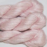
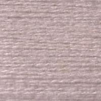
When I looked at the silk, I found close matches. For the light pink, I like PE-001 Blush. Looking at Pepperpot, I liked 228 Parfait Looking at Essentials, I liked 533 Lady Slipper. You can see all three compared with the floss below. The pictures are copyright KC Needlepoint for Planet Earth silk and Tilli Thomas for Peperpot and Essentials.


For the dark pink, I liked PE-010 Flicker Looking at Pepperpot and Essentials there were no colors that closely matched. The forces me to look at other threads unless I am happy with the choice I have You can see PE Silk with the floss below.


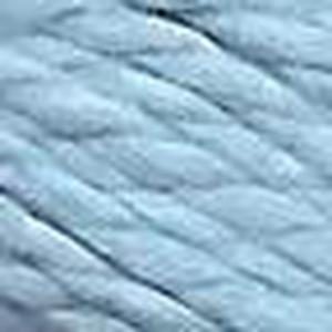
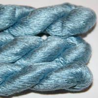
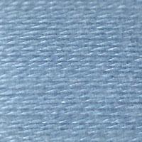
For the blue there were many possibilities (blue always has lots of choices in threads), but I liked PE-210 Spa best. Looking at Pepperpot, I liked 167 Stillwater. Looking at Essentials, I liked E-647 Bubbles.. You can see all three compared with the floss below.

Make your Final Selections
Review the threads you’ve identified with your floss selections. if you like compare them to your target color scheme.
I am happy with Flicker for the dark pink, I think it’s a close match. All three of the light pinks are too pink and not coral enough. If I was in a hurry, I would use the floss for my project. Another near-term possibility would be to use the lightest of the pink threads, the Pepperpot. If I had more time I would look for some extremely pale peachy-pink threads. For the blues, Essentials, in Bubbles, is the closest match. Because most thread lines have many blues, this would be another color to explore if there was time.


There you have it, a color scheme worked out from the book and ready for a project.
About Janet M Perry
Janet Perry is the Internet's leading authority on needlepoint. She designs, teaches and writes, getting raves from her fans for her innovative techniques, extensive knowledge and generous teaching style. A leading writer of stitch guides, she blogs here and lives on an island in the northeast corner of the SF Bay with her family

Leave a Reply