When I started doing needlepoint there wasn’t a huge selection of metallics; there were only a couple of dozen colors at most. The number of metallics out there has exploded giving us many colors and finishes. Because of this we can do things like shade with metallics, stitch a project using only metallics, or create interest by using different finishes in the same color.
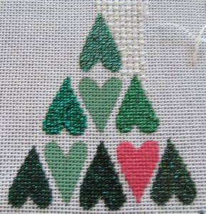
I do these things all the time but rarely do I think about the effects these metallics have on the color and the sparkle of my piece. Using this vintage canvas and five metallics from my stash, you can see that each heart has a different color and that some have more sparkle than others.
Let’s look at each one, starting with the middle row.
Middle Right: This heart was stitched with basic green Kreink (008). It’s a pure sparkly green, almost a crayon color.
Middle Left: This heart used the High Lustre version of the same color (008HL). As you can see, it’s more shiny than the basic color, but it is also darker. Because HL colors have twice as much metallic as the regular finish, with some colors this can darken the shade.
Top: This heart used one of Kreinik’s colors that is a mixture of more than one color of metallic. In this case it’s a mixture of green and white (3508). On the spool the changes from color to color are regular and sudden. When worked in Tent Stitch, however, these changes disappear, much as they do when you needleblend threads. The result is an optical mixing, creating a lighter green between the two colors in the spool.
If your main concern is color in a medium green, chose the white/green tweed for a lighter shade, the High Lustre color for a darker one, and the basic green for the shade closest to the color wheel color.
The bottom row uses three darker greens and shows us some other interesting aspects of these threads.
Bottom Left: This heart was stitched with the High Lustre version of Emerald (009HL). It is darker than the regular version of the same color (on the left) but it isn’t as shiny. That’s because I was using a very old spool of this color, one that is at least 20 years old. As it aged some of the shine wore off. You would not have this happen with a new spool of thread.
Bottom Right: Using basic Emerald (009) here you have a lovely dark green metallic.
Bottom Middle: This heart uses another tweeded color, but one with a dark base instead of a white one (850). Once again you get optical mixing, creating a shade that’s darker than the basic green because of the black in the tweed.
There are several finishes not covered here:
- Vintage: These threads, suffix “V” have a slightly matte, tarnished finish.
- Holographic: Adding mylar to the basic color, these colors (suffix “L”) are very shiny, far more than any other finish.
- Japan: Named for the Jap threads they resemble, these threads (suffix “J”) are shinier than the basic shades but not as sparkly as HL shades.
- Glow-in-the-dark: Seen under normal light, these colors (suffix “F”) tend to look washed out and milky. Under black light or in the dark, they will glow in their color.
- Matte: This small group of colors (numbers starting with “55”) have very little sparkle. The form the truest versions of the colors.
- Candy Floss: These colors (numbers starting with “57”) added a small amount of Mylar to the metallic creating colors that look as if they were wrapped in cellophane.
- Golden: These colors (numbers starting with “58”) added gold to the matte colors combining the purer bright colors of the matte threads with the feeling of seeing the color through gold.
Most of these finishes are only available in a limited number of colors. Not all colors are available in all sizes.
About Janet M Perry
Janet Perry is the Internet's leading authority on needlepoint. She designs, teaches and writes, getting raves from her fans for her innovative techniques, extensive knowledge and generous teaching style. A leading writer of stitch guides, she blogs here and lives on an island in the northeast corner of the SF Bay with her family

Leave a Reply