Before I started shading needlepoint canvases I always wondered if it was worth the bother. Yes, it is. No matter how big the color families are in threads, the spaces between the colors will be of different sizes. With paints, because you can blend to colors in an infinite number of ways, you can get an infinite number of shades between any two paints. Thread has discrete colors that cannot be blended in this way. When you look at colors in a color family, there is a visible jump from one shade to the next. The difference in value may be small or large but you can see the difference.
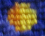
When you stitch this means that you get visible lines in your needlepoint between stitches made with two colors. The center of the pansy, while quite small shows you this. It isn’t too bad here, but in larger pieces, these lines can create unwanted folds or areas that look as if they are not connected.

The solution to this problem is to create the effect of intermediate colors by shading. Your eye, as we have said in a previous article, blends the two colors together to create an intermediate shade. This middle shade blurs the line between the two adjacent colors, easing the transition and making it look natural.
When we use two or more shades in the needle, we are creating optical blending on a strand level, with the possibility of more than one shade appearing on the top of any stitch. When we stitch in pixel shading we are creating the optical blends on a stitch level.
The worst thing that can happen when you shade in any form is that lines appear in your stitching. That’s because our brains crave patterns and will use just about any excuse to find one or create one. We trick our brains when we shade by breaking up outlines. The rule is very simple: never have more than three stitches in a row in any direction without a bump or a skip.
Related to this is a second rule the number of stitches in a color gets fewer as you move away from the area that is solidly that color.

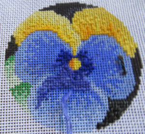
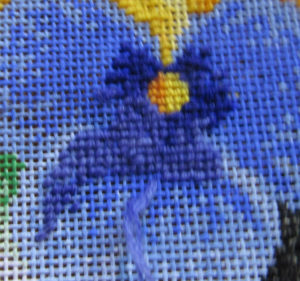
You can see this clearly at work in the violet petals. Only the darkest violet is stitched on the right and left petals. It’s easy to see how those outlines are very irregular. The center petal has the second color partially stitched. You can see how the irregular outline of the darkest shade makes it harder to see where one color ends and the second begins. You can also see in the side petals how the number of stitches in the darkest color diminishes.
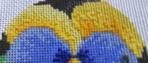
The final principle is one that you’ll want to use when you have larger blocks of color. Scatter single stitches outside the boundary of this color to add in more blending. You’ll see what effect this has in the next class but you can see how these are stitched with the darkest yellow, below. You can also see it on the left side of the center violet petal.

About Janet M Perry
Janet Perry is the Internet's leading authority on needlepoint. She designs, teaches and writes, getting raves from her fans for her innovative techniques, extensive knowledge and generous teaching style. A leading writer of stitch guides, she blogs here and lives on an island in the northeast corner of the SF Bay with her family

Interesting… Thank you!