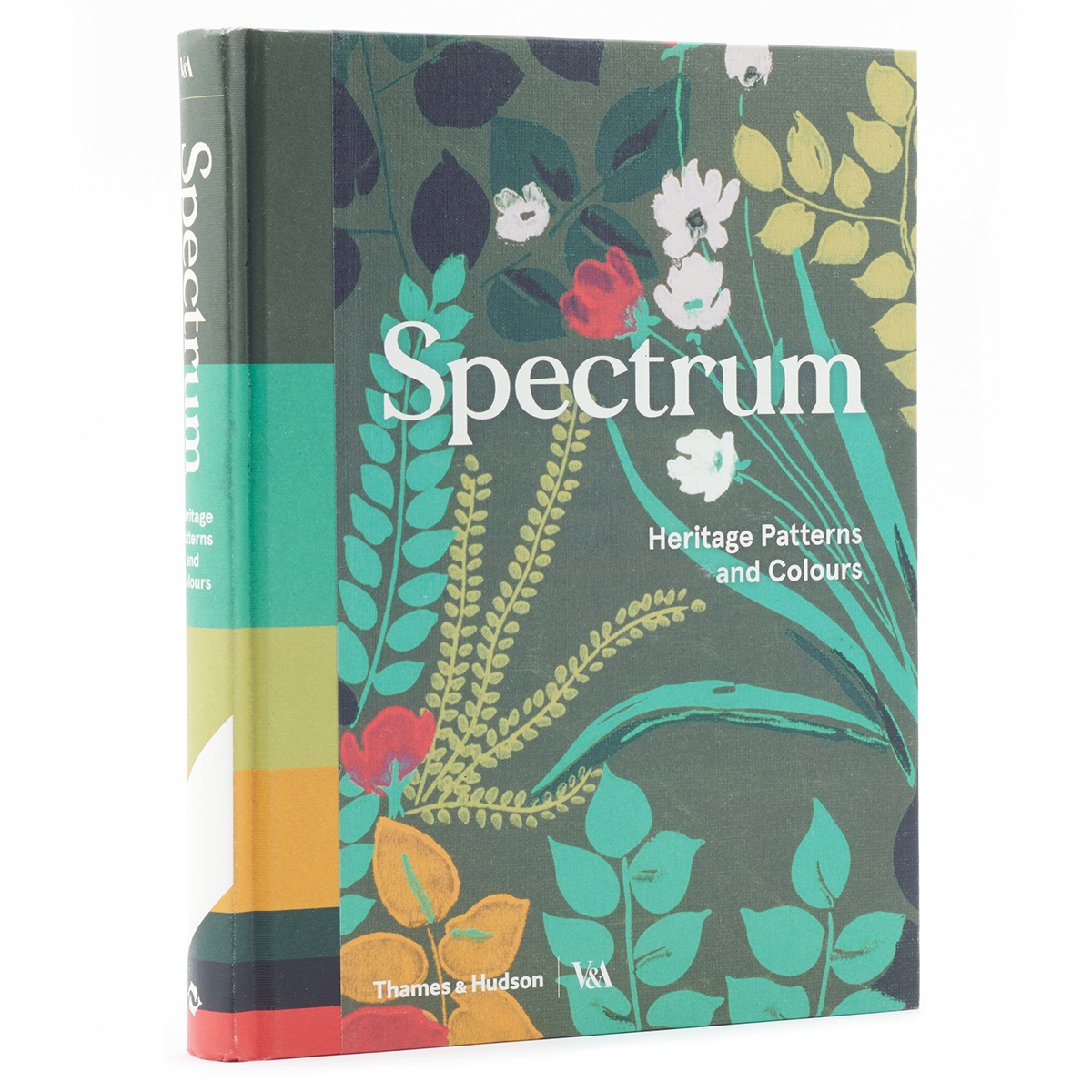
Heritage Patterns & Colors, Victoria & Albert Museum, (Thames & Hudson), 2018, $45. ISBN: 978-0-500-48026-7
I just got this book on Friday, and I am completely smitten with it. It’s packed full of inspiration based on textiles and wallpapers from the 15th Century until now. Even better, from each of these textiles, there is a color palette pulled. Unlike almost all of the palettes you see taken from photos and other places, these palettes take the colors and show them proportionally, as you can see by the picture further down the article. I’ll talk about using these after the picture, but I’ll look at the book first.
The chapters are divided by century, with each inspiration source is given its own two-page spread. The color palette is on top on the left, with each color identified by the CYMK numbers. Below that, you find the name of the piece, what it is (wallpaper, textile, etc.), and the date. In smaller type is information about the designer and/or manufacturer and the donor. Finally, a short text gives you more insight into the piece.
The variety of pieces shown is impressive, and all of them are drawn from the V&A’s fantastic collection. You’ll not only see wallpapers and fabrics but tapestries, embroideries, drawings, and pattern books. I just kept finding more and more delights as I paged through the book.
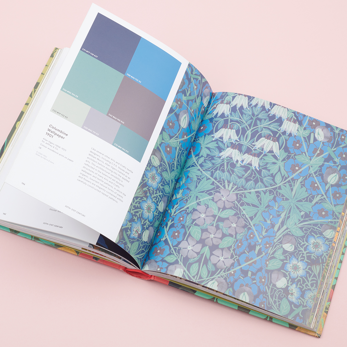
While the whole book is a feast, the color palette is of more immediate usefulness in creating a selection of threads for a project. The boxes are sized and displayed in order of how often they occur in the piece. At the top, the biggest boxes have the background color. If the background is quite extensive, this box can take up more than half the palette’s space. The next row of boxes will have the two primary colors in the design. The final has the accent colors in the smallest boxes. Although the vast majority of palettes follow this scheme, not all do. The size of the boxes always follows the extent of the colors:
- biggest — background & predominant color(s)
- second largest – main pattern color
- medium – important pattern colors
- small – accent colors
Not all sizes of boxes are in all palettes. For example, the Morris design pictured above has no main color but has the background and three predominant colors in equal boxes for the main pattern color.
This is wonderful, but how do you convert this knowledge into thread? That will require a bit of work on your part because CYMK (standing for Cyan-Yellow-Magenta-blacK) is the process used to print things, not the method used to find thread colors.
The first step will be to convert CYMK into RGB. That’s because a tool will convert RGB values into DMC color numbers (you’ll see that in the next step). Go to this CYMK-to-RBG Converter and enter the numbers listed on the color in your palette. I’m going to use as an example a mustard yellow, with values C:14, M:35, Y:100, K:1. Put that into my converter, and I get an RGB value of R (red): 217, G (green): 164, and B (blue): 0.
Next, you want to convert the RGB number to a DMC number. An excellent converter shows your original color, the closest match in DMC (with its RGB numbers), and three additional not-quite-as-close matches. When I put my RGB values there, I get 680 as the DMC match. It’s brighter than the original color, but it is a starting point.
If you are going to use DMC floss, you can stop here. If you want to use a different thread, use the DMC color to find other threads that match.
If you are paying attention, you’ll realize that there are possibilities for errors all along the way because we are converting. To prevent this, you have both the palette and the source picture for comparison.
I am very excited to try this in a new project!

About Janet M Perry
Janet Perry is the Internet's leading authority on needlepoint. She designs, teaches and writes, getting raves from her fans for her innovative techniques, extensive knowledge and generous teaching style. A leading writer of stitch guides, she blogs here and lives on an island in the northeast corner of the SF Bay with her family
Leave a Reply