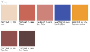
Yesterday Pantone announced their color palette for spring and summer 2019. They call it “New Native” and cite “As people today move through life, they adopt and blend other cultures with their own. The result is a design direction that celebrates mixed influences and cross cultural fertilization. Increasingly nomadic, our urban centers already considered cultural melting pots, are becoming progressively more diverse.”
I’m finding this palette very interesting, especially for us as needlepointers. Look at it, above,
except for the bright blue and yellow, its all earth-tone neutrals. These colors, especially the lighter ones are not my favorites, but their predominance here is a new trend in color.
It also gives us some exciting options to freshen our stitching. Look at these neutral colors as great possibilities for backgrounds. I have a couple of bee ornaments in my stash that I’m going to pick Cadmium Yellow for the bees and barn red for one background and linen for the other.
You can do this too. Look to use the blue and yellow as accents and the other colors as potential backgrounds. These colors will freshen your needlepoint instantly
About Janet M Perry
Janet Perry is the Internet's leading authority on needlepoint. She designs, teaches and writes, getting raves from her fans for her innovative techniques, extensive knowledge and generous teaching style. A leading writer of stitch guides, she blogs here and lives on an island in the northeast corner of the SF Bay with her family

Bleah!
Ditto what Jane said!! Four shades of barf-y terra cotta and a brown? I think not.
I do think it’s kind of weird how different they are. God knows, “earth-toned neutrals” are not my favorites. But I can see most of those shades working, each by itself, as a background for something brightly colored. And I have been obsessing about that yellow.
Keep stitching,
Janet