Updated December 10, 2019.
Being what I call hypersensitive to color, and having three children who share this trait to varying degrees, I am always thinking about color schemes. But all too often it can be hard to put together a scheme which is pleasing and fun for needlework, especially if you don’t know where to begin. Here are three methods you can use to create schemes using things easily found all around.
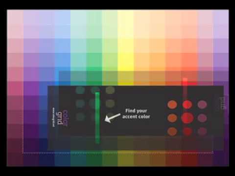
Color schemes usually have a dominant color (or colors) at least one secondary color and an accent color. The main color forms the majority of space in the design, the secondary color support it and the accent color gives it sparkle and life. In many things there is also a background color which supports and harmonizes with all the other colors.
Depending on how close these various shades come on the color wheel, the overall scheme can be classified as monochromatic (shades of one color), complementary (colors across from each other on the color wheel), analogous (colors next to each other on the color wheel) or triadic (forming a triangle on the color wheel).
The Overdye Method: Pick an overdyed thread. Using either a color card or skeins of solid-colored thread, find the main, secondary and accent colors. Use these colors to find threads for your project. By varying the texture of the thread, you can get a richer-looking piece. At this point you can choose whether to use the overdye in the stitched piece or set it aside for another day.
The Wallpaper/Fabric Method: Samples of fabric are rich sources of color schemes. You can make a needlepoint to work in your living room by looking at the fabrics you have already used. Most fabric and wallpaper had a background color. Ignore this initially and look at the other colors in the design. I have a book of fabric samples open next to me and am looking at a paisley design from the 1960’s. It has a hot pink background, with the figures in a light but saturated blue, crayon green, white and a yellow-orange. To create a needlepoint to harmonize, once again I would pull threads which match these colors. In the fabric blue is dominant, while the yellow and green are secondary and white is the accent.
But I don’t have to be bound by the scheme of the fabric as long as I am using the same colors. What about a garden of fantastic sixties style flowers in yellow, pink and blue on a white background. Or a geometric with blue and green with white and pink accents.
The Landscape Method: Every fall I really miss the bright colors of the forests of Pennsylvania where I grew up. California often seems color challenged in the fall. Our weather is hot, the leaves aren’t brilliant and I long for brighter colors.
But even so, the landscape gives me pause for inspiration. The vineyards often turn lovely shades of red and yellow among the remaining green. Add the deep navy blue of the grapes and you really have something.
A great way to find landscape based color schemes is to travel with a camera. Use either a cheap disposable one, or keep a roll of film in the camera and in your tote. If you see a great garden, a lovely color scheme on a house or whatever, snap a picture.
And if you are on your way to a needlework store, add a skein of overdye which most closely matches the colors you’ve seen on your way. Then you can use the methods above to match colors to that overdye or to the snapshot. I did this everal years ago basing my choices on the colors in the vineyards I passed as I went to my LNS. I created a lovely set of mini-socks using these as inspiration.
The Paint Scheme Method: There are paint companies, books, and color boards available to help you with putting together lovely color schemes. These all present a coordinated group of colors, usually three to five. Paint company schemes often have the dominant color picked out. These color schemes take their inspiration for almost any place and can be an addicting source of color ideas.
You can find cards with paint combinations in most paint stores. These are not shade cards where different shades of the same color show, but have a main color with accent colors. Sometimes they will also have a picture of the scheme in use.
Color scheme books are most often found in the art or graphic design section of bookstores. These books are designed for busy graphic designers to help them find color schemes for their work. They do not have tons of text and they can be intimidating. For our purposes we just want to look at the pictures to find combinations we like.
Color scheme sites may or may not have pictures but they will show swatches of several colors put together in a coordinated scheme. Because many of these sites rely on user submissions, there’s lots of stuff and it can vary in quality. But there is also lots of inspiration. At least one site has published a book of many of their schemes.
The Inspiration Board Method: With the growth of sites such as Pinterest and Instagram, you can find many pictures that can inspire you. Since almost anything can spark an idea for a color sceme consider creating a color inspiration board, folder, or file to put pictures that inspire you. Before I could do this on the computer, I kept notebooks of pictures. Many of these were included just because I liked the colors!
It’s a great idea to note down inspiring color schemes when you find them. That way you have a record when you are looking for a new scheme.

About Janet M Perry
Janet Perry is the Internet's leading authority on needlepoint. She designs, teaches and writes, getting raves from her fans for her innovative techniques, extensive knowledge and generous teaching style. A leading writer of stitch guides, she blogs here and lives on an island in the northeast corner of the SF Bay with her family
And here is where a digital camera is perfect. You can take LOTS of pictures and load them to your computer. Never have to print them. Always available. Three cheers for the tech age!