If you want your lettering to stand out on a canvas, consider metallic or part metallic threads. I didn’t do this in the past. This year, I have used these threads on three different canvases and I love the results.
Canvases with sayings can be problematical for many reasons. Often the area with the saying is very plain. You want it to be the focal point, but it shouldn’t be out of line with either the border or the background. I always found my self wondering if these threads were just too much.
Sometimes the lettering color is much darker than the background. This concern may cause you to lighten the letting color or make it in a thread that won’t stand out as much.
Choosing a more attention-getting thread but stitching the background first brings the eye to the saying through, texture (metallic), color, and value (darker), while avoiding shadows.
Today we’ll look at three possibilities for threads for lettering and places to use each of them.
Lettering on the Complex Background
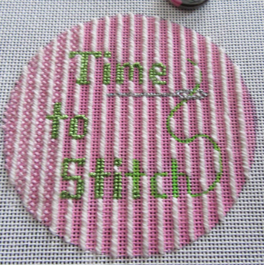
In the Time to Stitch canvas above we have a busy background with stripes and a pink color. While pink and lime is a classic color combination, the colors are similar in value. In order to create lettering that won’t disappear, contrast, and lots of it, needs to be added.
Here’s where the large textural contrast of metallic works great. By putting metallic, a High Lustre Kreinik, against matte wool and silk floss, we create contrast that was not there with the color alone. By choosing a lower stitch for the pink we created additional contrast there as well.
I have a new baby frame to stitch where I will use navy metallic to make the letters stand out against a white and pale blue striped background.
Metallics that are more shiny, even holographic colors, work very well against complex backgrounds.
Lettering on White
Where you have lettering against a white background, you can turn to less shiny metallics for the letters. Examples of these include Kreinik’s “matte” metallics (5500 series) and Rainbow Gallery’s Soft Sheen Fyre Werks. I especially like that thread because it comes in many colors and stil reads as metallic but wirth a less sharp contrast.
I have a pretty saying canvas I am going to start soon that will use this approach.
The Low Contrast Solution
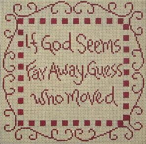
In this Cooper Oaks piece we have both an elaborate border and the saying filling up much of the center. Stitching it in either of the more metallic option would just be too much. Happily among the newer threads we have great options of threads that combine a base thread with metallic.
Threads like this are available from many companies and use every fiber you can think of combined with metallic. When stitched they create the texture of the base thread with bits of metallic showing through. The amount of metallic you see depends on the metallic content of the thread. Pick the thread based on how much bling you want.
If you can’t find the color you want in these threads, you can make your own. Combine a single-stranded base thread with a very thin metallic. Good choices for the metallic include blending filament, fine Bijoux, Accentuate,, and Sparkle Braid. Often these are harder to use than already-combined threads because of static electricity. Twist the threads together slightly before stitching, use shorter lengths, and stitch carefully.
By your choice of metallic, you can mae saying canvases stand-out.

About Janet M Perry
Janet Perry is the Internet's leading authority on needlepoint. She designs, teaches and writes, getting raves from her fans for her innovative techniques, extensive knowledge and generous teaching style. A leading writer of stitch guides, she blogs here and lives on an island in the northeast corner of the SF Bay with her family
Leave a Reply