Updated June 29, 2021.
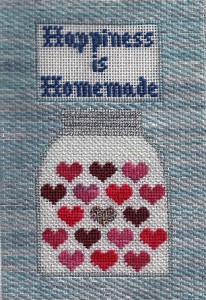
OK, I admit it, I was frustrated. You know that little vintage Petei design I made for a Christmas present? The one where I changed the colors?
I had a devil of a time finding a background. I tried four different ones before I found one. I have cut out tons of stitching; The same thing happened Sunday when I worked on a Kathy Schenkel ornament. It’s all instructive, so I thought today I would go through what I tried, why it didn’t work, and what I learned.
Vertical Triple Parisian – I saw this in the current Needlepoint Now, and since Triple Parisian is one of my favorites, I thought turning it to vertical would look good here.
Wrong!
With the lettering, the scale of this stitch was just too big, even though it is a pretty small stitch. There isn’t enough uncluttered background here to get three repeats anywhere.
The solution was to go with a smaller, more horizontal stitch, where I could get three repeats. So I went with:
Giant Horizontal Cashmere – Plenty of repeats, so the scale was fine. But when I stitched around the lettering, the letters got so obscured that they couldn’t be read no matter what I tried.
The solution is to treat the lettering like a sign and not bring the background into it. So I went with:
Woven Plait – I was getting closer, but the combination of the small, highly textured stitch with the overdyed silk I’m using didn’t look good. It didn’t even last a row.
Pattern Darning – Simple overall running stitch pattern still using the sign idea will showcase this lovely thread and let the lettering shine. It will also go fast, so I’ll get it done in time. I ended up using pattern darning on the newer piece as well. Looking at it finished yesterday, it looks great!
Usually I’m better than this with backgrounds. A good background should:
- not overwhelm or obscure the focal point
- be in scale with the piece
- be in a thread/stitch combination that highlights the focal point
- be suitable for the deadlines you have
But painful as it is to rip out, taking time to find the perfect background is always worth it.
About Janet M Perry
Janet Perry is the Internet's leading authority on needlepoint. She designs, teaches and writes, getting raves from her fans for her innovative techniques, extensive knowledge and generous teaching style. A leading writer of stitch guides, she blogs here and lives on an island in the northeast corner of the SF Bay with her family

Hi Janet,
Thanks for your post. I often have problems when it comes to deciding on what stitch to use for a design. It is reassuring that you occasionally experience the same problems. It also was informative on why you decided that a specific stitch was not appropriate for a specific project.
Happy holidays. Hope that 2012 brings you and everyone else on this site the happiest of new years and many new and exciting projects.
Marlene
I love reading your blog, but some pictures in your posts would go a long way to furthering that enjoyment. Needlepoint is after all a visual art, and some visuals to go along with your tantalizing prose would be much appreciated!
Because this was a Christmas present, I couldn’t do a picture for this post, although the vast majority of posts on this site have pictures.
If you want to see this finished piece, check out this post: https://napaneedlepoin.wpengine.com/happiness-is-homemade-the-finished-product
I’m not adventurous with stitches but live seeing them. “Open” stitches with background are still out of my wheelhouse, but I love the effect. Just realized how careful and neat you have to be with back side of work! Lovely. And I realize I WILL have to unstitch a big project that isn’t yet ‘finished’ because the background isn’t quite what I thought it would be. ? And it will be worth it.?