When looking for art to adapt to needlepoint, posters are a rich source of ideas. Posters span all kinds of subjects and most styles of art. Even so, they mostly tend to be simpler and less detailed than paintings. That’s for a couple of reasons. First, they are made to be reproduced in quantity, used, and discatrded. Second, the technology to make them often limited the amount of detail and number of colors.
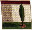
Whatever the reasons, posters make great starting points for adaptation. In today’s article I’ll look at a poster I adapted, above, to show how I turned it into needlepoint.
This poster is by one of my favorite artists, David Lance Goines. You probably know him best for his posters and book covers for Chez Panisse. He’s been doing their posters since they opened. He is still making lovely posters in Berkeley, CA.
The style of the poster has a very strong Arts & Crafts feel. Elements that contribute to that are the outlines, the flat surfaces, and the muted and natural color palette. What’s interesting to me looking at it how effectively Goines balanced the Arts & Crafts colors of taupe, white, green, and burgundy with that little pop of dusty rose in the soil.
Combined with the simple shapes typical of more modern art, it makes the design more than just Arts & Crafts. It becomes contemporary but timeless. It also makes it easy to adapt as needlepoint.
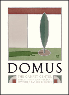
Domus was made by him in 1984 for a carpet store in Berkeley. I have chosen to adapt, with permission, the drawing in the poster. I love the graphic simplicity of it. I stitched it using only one thread, Silk & Ivory, and three stitches, Tent, Mosaic, and Framed Scotch.
I used a picture of the poster to draw the design onto my canvas. You can also enlarge and trace the design. I stitched the outlines using Tent in taupe. This defined most of the spaces.
Although the poster has no texture in the building, the needlepoint needed some texture. This would help to make the tree the focal point. Often needlepoint has to use textured stitches in order to keep the design from looking too flat, something that happens in many all-Tent pieces. That’s because each stitch, even Tent, has shadows and shape. Instead of being flat, like paper, all needlepoint has texture. An all-Tent piece looks dull because the texture is small and monotonous. By adding other textures you can break away from this.
Using the height of the burgundy panel, I decided on a size of framed Scotch. From that I stitched the tan panel of the wall as well as the white panel down to the tree. Once this was complete I stitched the grass, down to the shadow, in Mosaic. I added the tree’s shadow next, keeping the stitch pattern consistent. Then I could complete the grass.
The last steps were to stitch the dirt and the tree. These are in Tent.
To summarize:
- When adapting a poster look for simple shapes that can easily translate to needlepoint.
- Pick threads and colors to match or reflect the original art.
- Decide on a focal point and picks stitches to enhance that, do not stitch in all Tent.
- Transfer your drawing of the correctly-sized poster to your canvas.
- If outlines are used stitch these first, then the background, then middle ground, then focal point.

About Janet M Perry
Janet Perry is the Internet's leading authority on needlepoint. She designs, teaches and writes, getting raves from her fans for her innovative techniques, extensive knowledge and generous teaching style. A leading writer of stitch guides, she blogs here and lives on an island in the northeast corner of the SF Bay with her family
Leave a Reply