
Updated: May 29, 2018
Color schemes are so fascinating to me. You can spend a lifetime jiggling with them and still be surprised. Medium and technique change how colors work together and getting comfortable with the different types of color schemes can make your needlepoint sing.
I tend to classify color schemes into four broad groups, all of which have several sub-types, here with pictures of projects in each scheme.
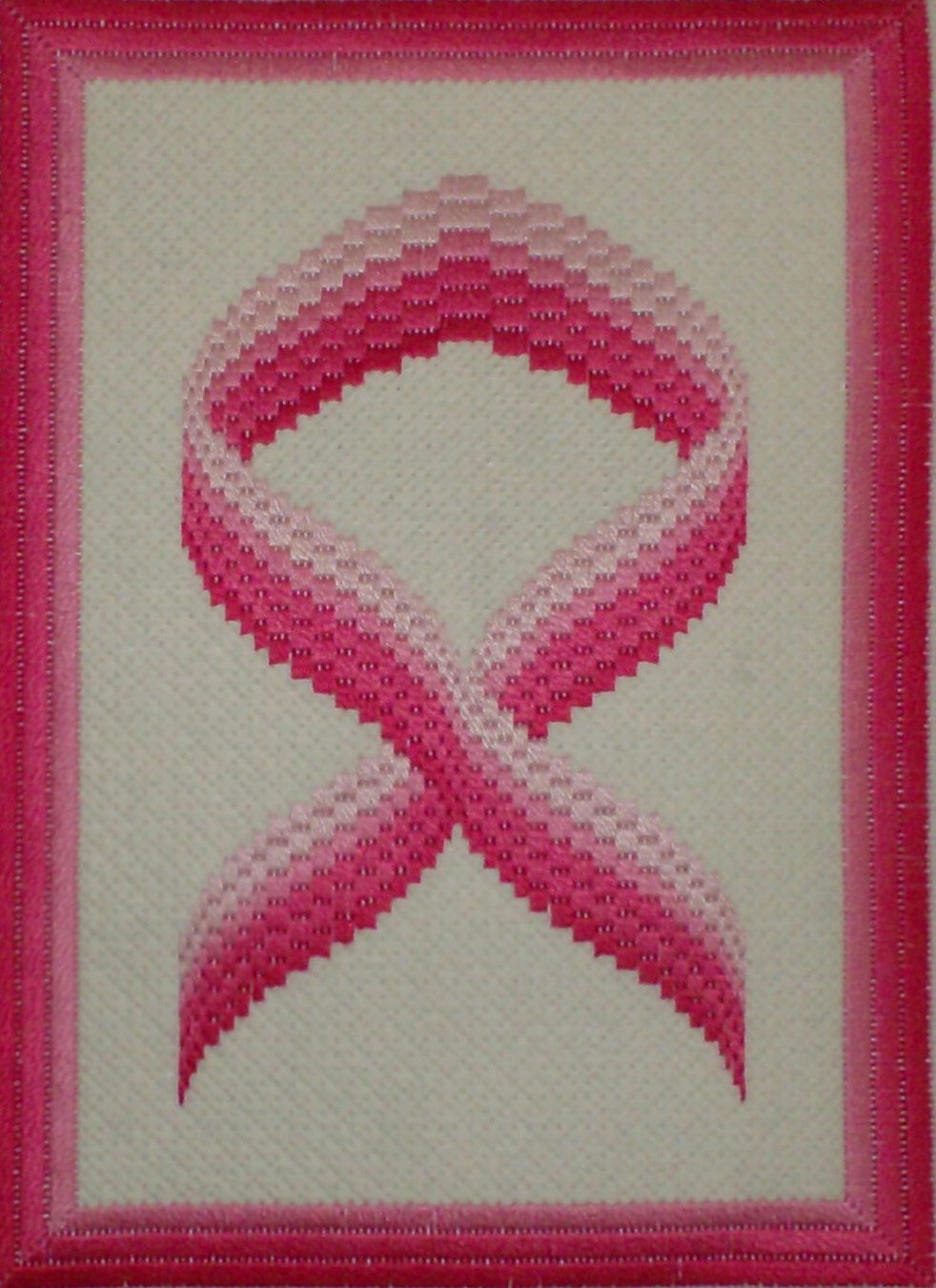
Monochromatic color schemes are made up of shades of a single color. many traditional Bargello patterns use this scheme. A monochromatic with neutral scheme has shades of one color with the addition of white, black or gray. A traditional toile is am example of this. Neutral color schemes are made up of beiges, browns, whites, black and grays. In many cases a monochromatic color scheme greatly benefits from changes in texture since the color is so controlled.
The picture is of my Pink Ribbon Bargello, available here.
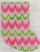
Complementary color schemes take advantage of the natural complements of each color. Complementary colors are usually found across from each other on the color wheel and include pairs like red-green, yellow-violet, and blue-orange. A complementary scheme can take advantage of different values in the color, such as a paring of pink with dark green (a personal favorite). If the two shades next to one of the complements are used, this is a split complementary scheme. This red would be paired with yellow-green and blue-green. If both parts of the complement are used, making a set of four, this is a double split complement, a scheme which can be a bit hard to handle. A powerful and popular version of complementary schemes are near complements, such a red with blue. Taken just by themselves these colors often vibrate against each other. Tempered with white of black, either make tints or adding white to the scheme, you get classic combinations like red, white and blue or baby blue and pink.
The project pictured is my Prepster Bargello stocking. It uses a Bargello pattern from Bargello Revisited, available here.
Analogous color schemes use three or more colors next to each other on the color wheel. These schemes are naturally harmonious and don’t have to be confined to the hot or cool colors. Right now I’m working on a autumnal scheme which is using orange, yellow and green. All three colors are united by having yellow in them, making a vibrant look.
The heart twinchies pictured at the top of the article are examples of analogous color schemes.
center>
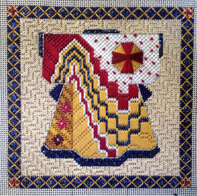
Triad schemes use three colors, making a triangle on the color wheel. The triad of primary colors (red, yellow, blue) is one triad. But other kinds of triangles can be formed, creating new places to explore color.
I tend not to use this color scheme often, but the Bargello Kimono pictured here is by Wendy Moore and is on my list to do.
There’s much more to lear about color. You’ll get a great start in Color, the first Predictable Results for Needlepoint book, available here.
With threads, the stitcher has an almost unlimited palette of colors for developing color schemes. Use your threads to try out some new combinations!

About Janet M Perry
Janet Perry is the Internet's leading authority on needlepoint. She designs, teaches and writes, getting raves from her fans for her innovative techniques, extensive knowledge and generous teaching style. A leading writer of stitch guides, she blogs here and lives on an island in the northeast corner of the SF Bay with her family
[…] Types of Color Schemes […]